
Ecommerce website redesign case study: Kilo Game
Most ecommerce owners know their shop is underperforming long before they can explain why. Traffic arrives, people browse, and then they leave. This ecommerce website redesign case study is exactly that situation, taken apart and rebuilt. Kilo Game is a Danish home fitness brand selling weights, benches, cardio machines and complete home gym sets. Their old shop worked in the sense that you could technically buy from it, and it sold far less than the products deserved. Below is what was holding it back, the decisions we made in the rebuild, and the numbers that came out the other side.
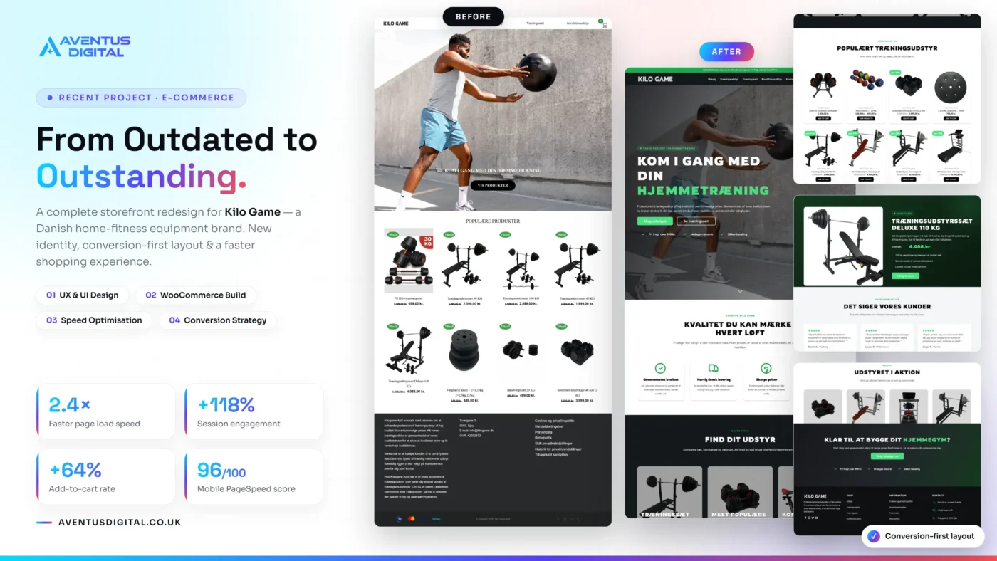
Kilo Game moved from a slow, flat WooCommerce catalogue to a conversion-first storefront rebuilt by Aventus Digital. The redesign produced 2.4 times faster page loading, a 118% lift in session engagement, a 64% increase in add to cart rate and a 96 out of 100 mobile PageSpeed score. You can see the finished store at Kilo Game.
The brief: a shop that looked fine and sold poorly
Kilo Game ApS sells professional grade training equipment at accessible prices, ships from Fyn across Denmark, and quality tests every product before it goes on sale. That is a genuinely strong proposition. The problem was that almost none of it reached the shopper. The old site opened with a large photograph and a serif headline, then dropped visitors straight into one undifferentiated product grid. Everything the brand had earned, the testing, the delivery speed, the honest pricing, sat in a block of text at the very bottom of the page.
The brief we were given was short: make the shop feel as serious as the equipment, and make it sell. Average order values here are high and the products are heavy, so every abandoned visit is expensive. Someone weighing up a 4,088 kroner home gym set needs far more reassurance than someone buying a phone case, and the old store gave them almost none.
What was holding the old store back
Every website redesign we take on starts with a diagnosis rather than a mood board. Here is what the audit turned up.
- The hero asked for nothing. A full width photo with a white serif headline set over a mid grey concrete wall, and one vague button underneath. Poor contrast, no offer, no reason to keep scrolling.
- Trust signals were buried. Free delivery, the 14 day returns policy and secure payment all lived in the footer, which is precisely where a nervous first time buyer never looks.
- The catalogue had no shape. Dumbbells, benches, weight plates and complete sets all shared one flat grid, with no categories, no filtering and no obvious starting point.
- Discounts were invisible. Small sale tags carried no percentage, so a 41% saving looked identical to a token one. The strongest commercial argument on the page was doing no work at all.
- The brand story was formatted as small print. Real claims about quality testing and fast Danish delivery, set as a dense grey paragraph block beneath the products.
- There was no social proof anywhere. No reviews, no photographs of the equipment in a real garage or basement, nothing to settle the doubt before a large purchase.
- The page ended in a footer. Anyone who read all the way down was handed navigation links instead of a next step.
None of this is unusual. These are the same faults we set out in 5 signs your website is costing you customers, and they compound quietly. No single item loses a sale on its own. Together they lose most of them.
How we rebuilt the store
The rebuild is the substance of this ecommerce website redesign case study, and it was a full ecommerce website project on WooCommerce rather than a theme swap with new colours. We mapped the path a shopper actually takes, then designed on top of it.
- Rebuilt the hero around one decision. A dark overlay lifted the headline off the photograph, the brand promise moved into a short supporting line, and the single vague button became two clear routes: shop the sale, or browse complete training sets.
- Moved trust above the fold. Free delivery over 999 kroner, 14 day returns and secure payment now sit directly beneath the hero buttons, and repeat again at the bottom of the page where the decision is genuinely made.
- Gave the catalogue a structure. Four clear categories in the navigation and three category cards on the home page, so a visitor who wants a complete set never has to scroll past cardio machines to find one.
- Made the savings impossible to miss. Every reduced product now carries a visible percentage badge with the old price struck through, so a 41% reduction reads as a 41% reduction at a glance.
- Gave the best seller its own space. The 110 kilogram deluxe set is the product that defines the range, so it earned a dedicated block with benefit bullets, the full saving shown, and a single add to cart action.
- Added proof in the customer’s own words. Six reviews with real names and Danish cities, plus a gallery of the equipment set up in actual homes rather than studio renders.
- Closed the page properly. A final call to action with a same day dispatch cut off, so the last thing a shopper reads is a reason to order today rather than a list of links.
- Rebuilt the technical foundation. Compressed and correctly sized imagery in modern formats, lazy loading below the fold, caching, a clean heading hierarchy and product schema. This is the layer that produces the speed numbers, and it is the layer most redesigns skip.
Speed was treated as a conversion feature rather than a technical vanity score. Google sets out the same relationship in its guidance on Core Web Vitals, and on a store selling equipment this heavy, every second of hesitation costs money. For the mechanics underneath the build, the WooCommerce documentation is the reference we keep open, and as Flatsome experts we build on a theme that stays light rather than one that fights the page speed work.
The results
Numbers are the only honest ending to an ecommerce website redesign case study. All figures below were measured on the same product and category pages, on mobile, before and after launch.
- 2.4 times faster page load speed. The single biggest lever, achieved through image optimisation, caching and stripping weight out of the front end rather than buying a bigger server.
- 118% increase in session engagement. Visitors now go deeper into the catalogue instead of bouncing off the home page, which is what happens when a shopper can see where to go next.
- 64% increase in add to cart rate. The clearest commercial signal in the set. Visible discounts, trust badges above the fold and a properly structured catalogue all feed this one number.
- 96 out of 100 mobile PageSpeed score. Most WooCommerce stores sit in the 40s and 50s on mobile. Getting into the 90s takes deliberate work at build time, not a caching plugin bolted on afterwards.
Worth saying plainly: the engagement and add to cart gains did not come from clever design flourishes. They came from removing friction and answering the questions a buyer was already asking silently.
What this ecommerce website redesign case study says about your own shop
Kilo Game is a Danish fitness brand, but almost nothing in this rebuild is specific to Denmark or to fitness equipment. If you run an online store, three things transfer directly.
- Your home page is a routing decision, not a poster. Its job is to get each visitor to the right category quickly. Anything that does not help with that is decoration.
- Reassurance belongs where the doubt is. Delivery, returns and payment security need to appear at the point of hesitation, which is the hero and the checkout, not the footer.
- Speed is commercial, not cosmetic. A store that loads in a second outsells the identical store that loads in four. It is the cheapest conversion work available to most shops.
If any of that sounds familiar, the fastest way to find out where you stand is a free website audit. We will tell you what is costing you sales before you spend anything.
How Aventus Digital helps
We are a team of top rated freelancers with 7 plus years of experience, 650 plus five star reviews and 600 plus websites delivered across 40 plus countries, now operating as one agency for UK and worldwide businesses. Kilo Game is one project among many, and you can see more of the same approach in our ecommerce portfolio and our fitness and gym work.
Every build we ship has SEO, GEO and AEO structured in from day one through our SEO and GEO Audit, and we keep sites fast after launch with website maintenance care plans. If this ecommerce website redesign case study describes your shop, we will show you what yours could look like before you commit to anything.
You Might Also Like
- 5 signs your website is costing you customers the faults we find in almost every audit.
- Flatsome UX Builder tutorial for beginners the builder we used for this store, explained.
- What is GEO? The UK business owner’s guide how to get cited by AI search.
- Why is my website slow? 9 causes and how to fix them
- WordPress vs Wix & Squarespace: which is better for a UK small business?

Author
Zubayed Feroz
Founder of Aventus Digital
Frequently Asked Questions
How long does an ecommerce website redesign take?
A typical WooCommerce redesign takes two to four weeks from brief to launch, depending on how many products need migrating and how much new content is required. Stores with a large catalogue or custom shipping and tax rules sit at the longer end. We agree the timeline before starting so you are not left guessing.
Will a redesign hurt my existing Google rankings?
Not if it is handled properly. Rankings drop when URLs change without redirects, when page titles and headings are rebuilt carelessly, or when content is thinned out during the move. We map every existing URL, redirect anything that changes, and carry your indexed content across deliberately rather than starting from a blank page.
Do I lose my products, orders and customers in a WooCommerce redesign?
No. Products, orders, customer accounts and reviews all live in your WordPress database, separate from the design layer. We rebuild the storefront on top of that data, so your order history and customer records stay intact throughout.
How much does an ecommerce website redesign cost?
Our ecommerce builds start at £499, with a mid tier at £899 and a flagship tier at £1,999 for larger catalogues and custom functionality. Pricing is published rather than quoted case by case, so you know the figure before you speak to us. Most owners start with a free audit to see what actually needs changing.
What actually causes an increase in add to cart rate?
Rarely one thing. In this project it came from making discounts visible as percentages, moving delivery and returns information above the fold, giving the catalogue real categories, and cutting load time so shoppers stayed long enough to browse. Each change is small and the effect is cumulative.
Related Blogs
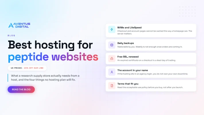
Which Hosting Is Best for Peptide Websites?
Short answer: Hostinger is what we put research peptide stores on, and our link takes [...]
Oct

Is It Legal to Sell Research Peptides in the UK? The MHRA Line, Explained for Store Owners
Short answer: selling research peptides in the UK is lawful in itself, and it stops [...]
Oct

How to Start a Peptide Business in 2026: Costs and Steps
Short answer: to start a peptide business you register the company, open the bank account, [...]
Oct

Best Ecommerce Platform for a Peptide Store (2026)
Short answer: the best ecommerce platform for peptides is a self-hosted WooCommerce store. Hosted platforms [...]
Oct
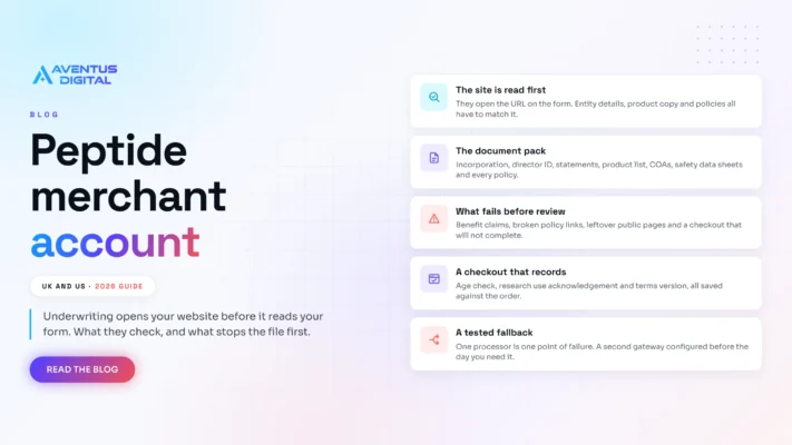
The peptide merchant account application pack that gets approved first time
Short answer: a peptide merchant account is won on evidence, not on wording. Underwriting opens [...]
Sep
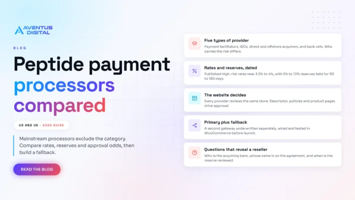
Peptide Payment Processors Compared: US and UK 2026
Short answer: mainstream processors such as Stripe, PayPal and WooPayments exclude the category, so a [...]
Sep
Selling Peptides on Shopify: Why Stores Get Shut Down
Short answer: not for long. You can open a store and sell peptides on Shopify, [...]
Sep

Peptide website compliance and how to get approved for payments
Short answer: peptide website compliance is decided on four things. A research use only position [...]
Sep